With 45 years of experience, Olsen stands out as a truly Brazilian industry committed to innovation and excellence. Its products meet international quality standards and hold certifications recognized by the most important regulatory bodies, ensuring reliable and safe clinics for customers.
A Website We Developed to Enhance the Olsen Experience
To create a cohesive visual manual for Olsen, it is crucial that the elements convey the company’s values, honoring its 45-year legacy. Let’s explore how to express stability, boldness, and solidity in the design
A Consistent Visual Identity
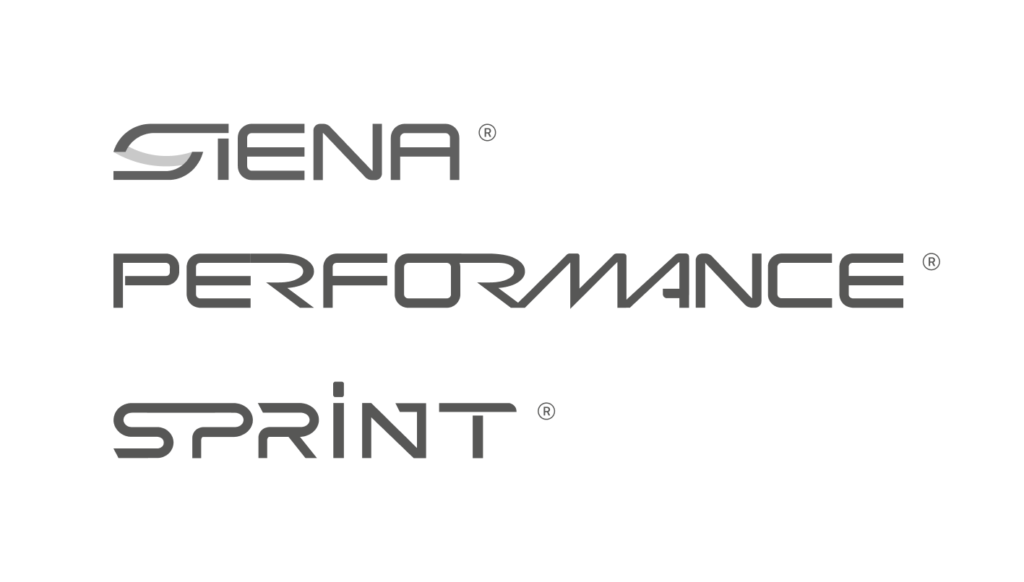
Olsen had two product logos updated, while the other product lines still used outdated logos. We decided to unify the visual language of all products, refreshing their images with a more professional and dynamic design.
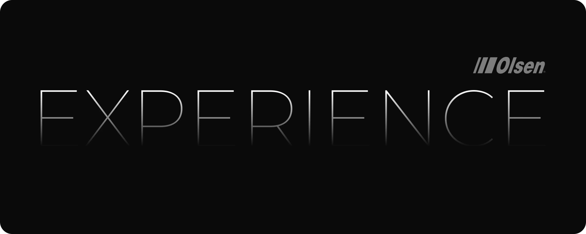
Dental Line | Before Visual Update
Dental Line | After Visual Update
We were tasked with updating the logos of Olsen’s dental line, bringing a more modern identity aligned with the brand’s innovation. The result reflects the reliability and excellence that make Olsen a benchmark in the industry.
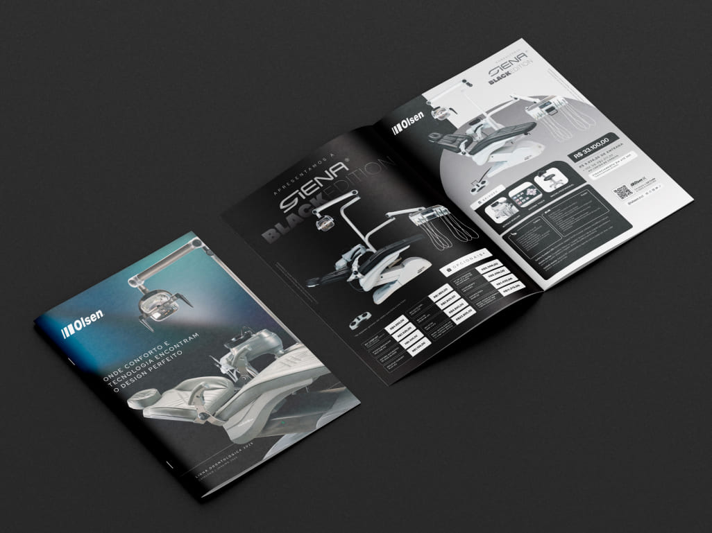
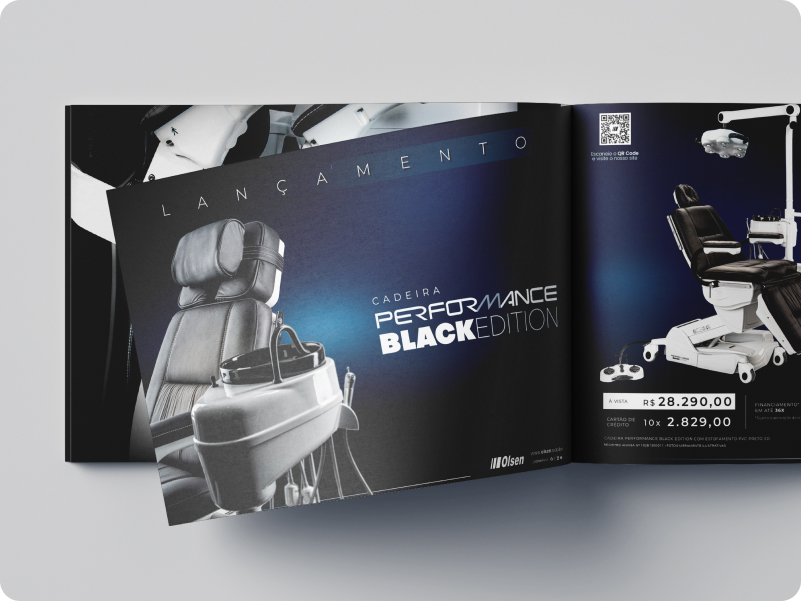
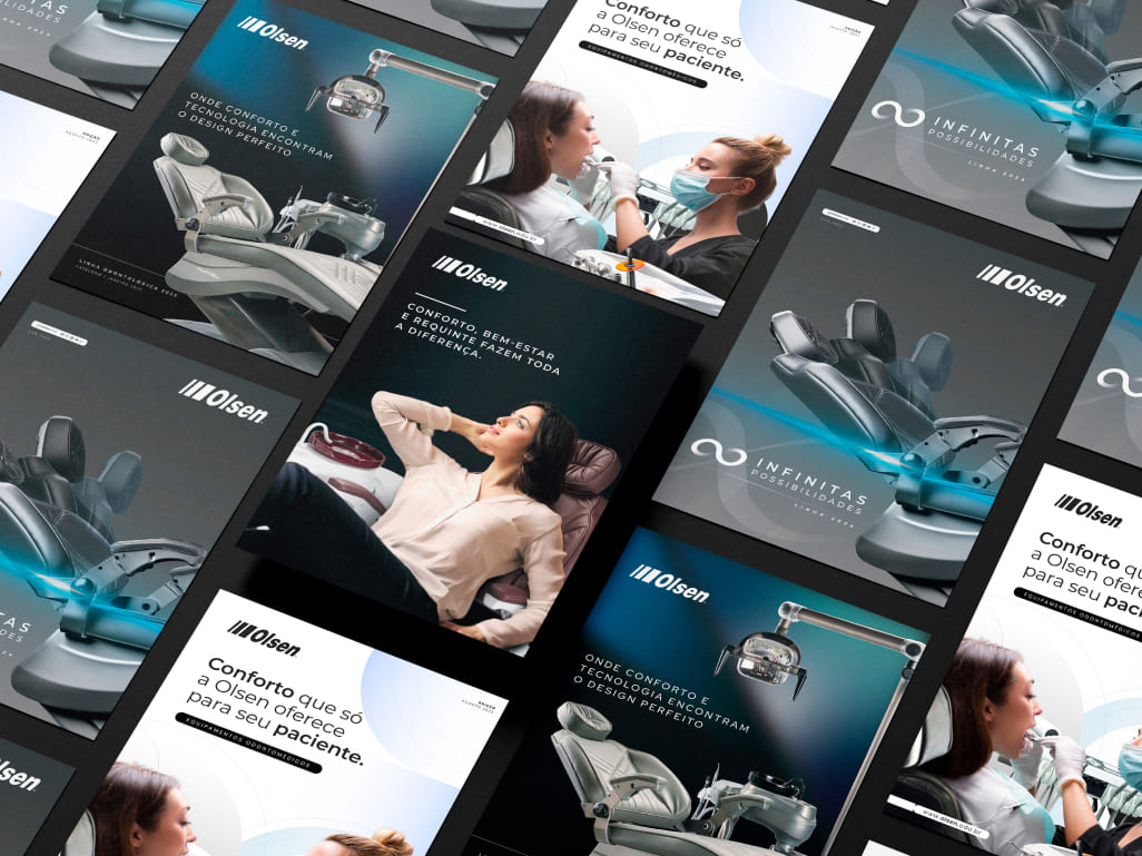
Catalogs and Graphic Materials
New Products
The Olsen Family Has Grown!
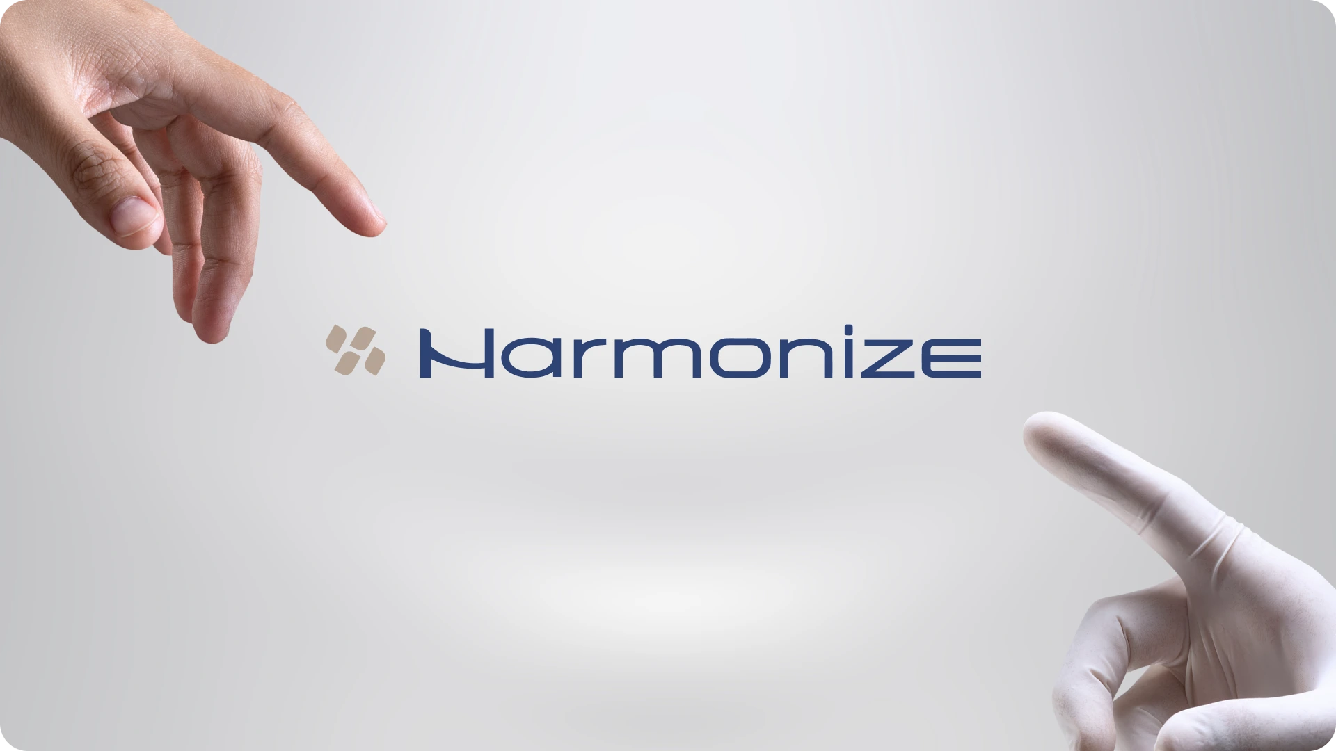
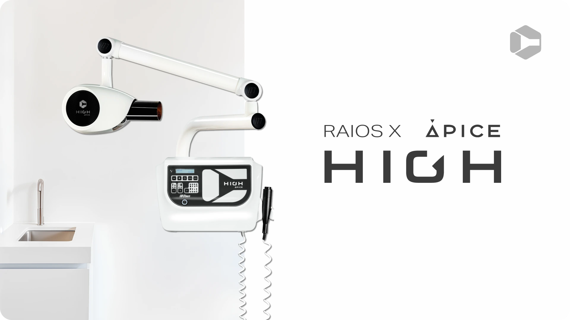
With the arrival of three new products — the Harmonize dental chair, the OdontoNomad mobile unit, and the Ápice High dental X-ray — we developed a unique visual identity for each, aligned with Olsen’s commitment to innovation, quality, and reliability. Each design was crafted to highlight the essence and functionality of these launches, strengthening the brand’s presence in the dental industry.
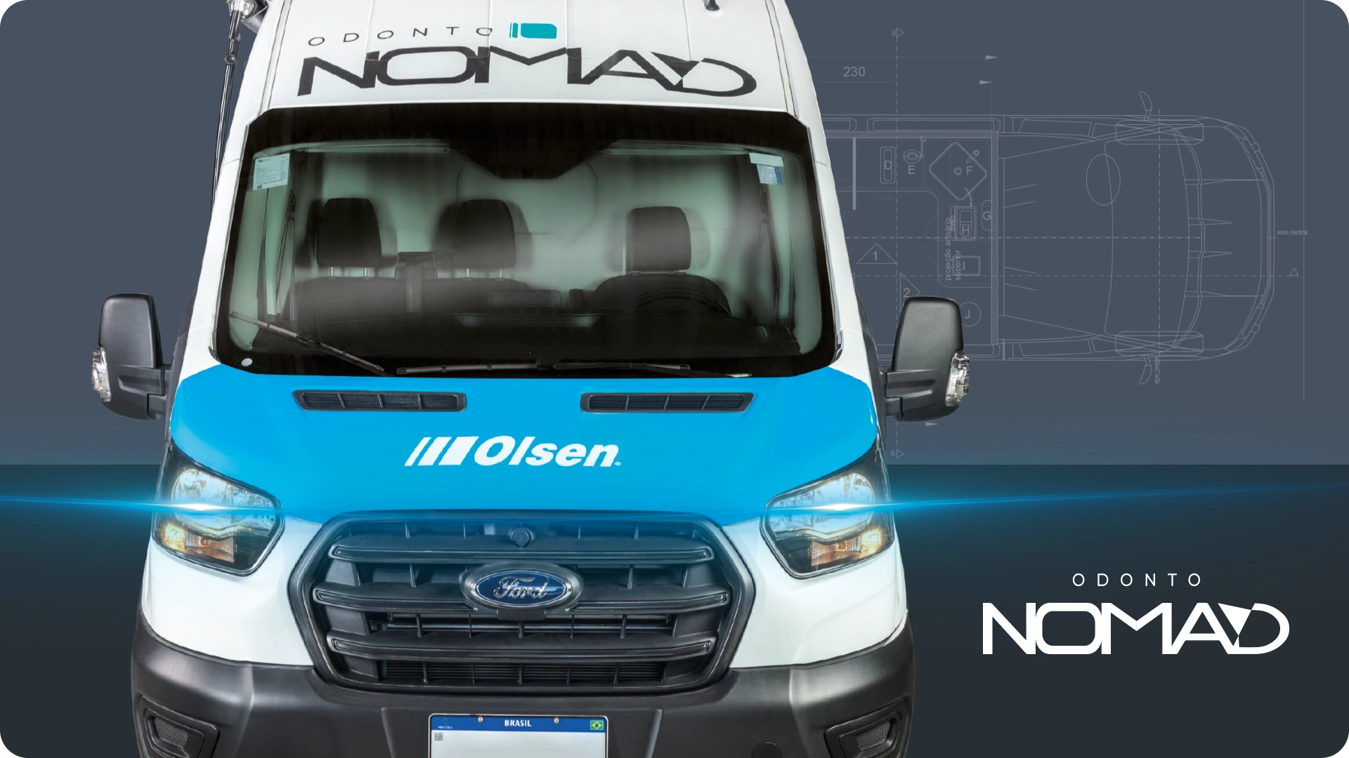
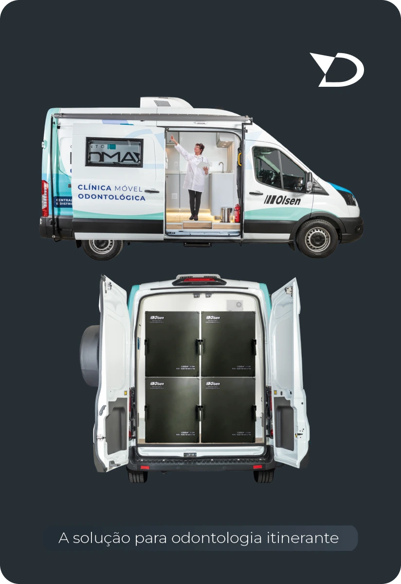
Olsen’s Mobile Unit (OdontoNomad)
The OdontoNomad is a dental clinic on wheels, equipped to meet various dental needs. With modern technology and intelligent design, we provide a safe and efficient environment for dental procedures.
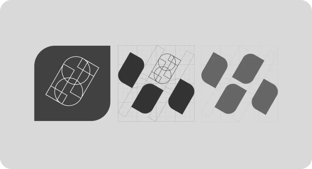
The visual identity of the Harmonize dental chair was created based on the letter ‘H’, represented by four symmetrical elements arranged in a diagonal pattern. This design offers a balanced and dynamic look, conveying the harmony that names the product. The composition reflects the solidity and comfort characteristic of Olsen, combining aesthetics and functionality in a strong and memorable brand.
The Ápice dental X-ray evolved into Ápice High, highlighting its operation at high frequency. To represent this new phase, we developed a logo that integrates typography and an icon, creating a strong visual identity aligned with the product’s innovation.
The icon design was inspired by the shape of the X-ray head, resulting in a futuristic and solid representation. This approach reinforces the technology and precision of Ápice High, conveying modernity and reliability — qualities that define Olsen’s excellence.
New Packaging
Previous packaging design
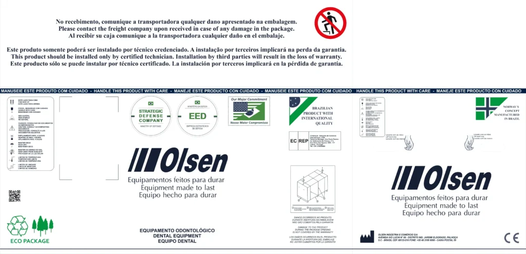
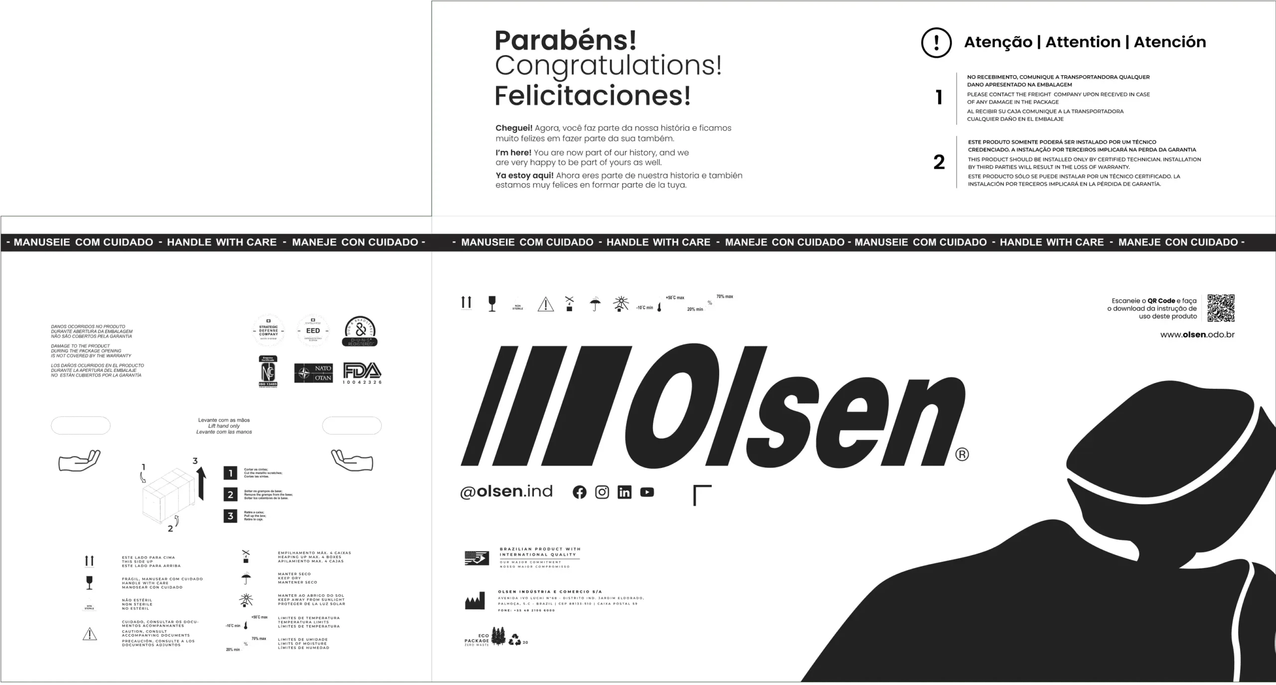
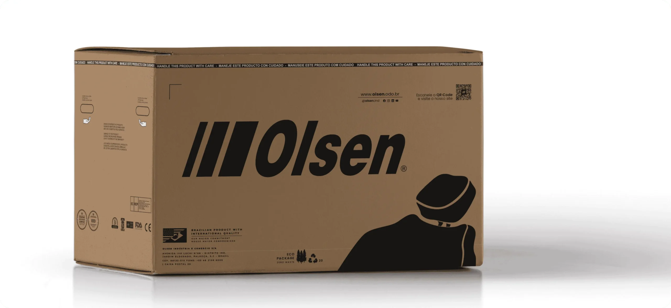
The distribution of informational aspects and certifications was applied to the sides of the packaging, freeing up more space to highlight the brand on the front.
Congratulating the customer on their purchase and delivering a motivational message are essential elements in the user experience, especially in the design of physical materials. This care became even more relevant with the new eco-friendly packaging models. Therefore, we included a message in Portuguese, English, and Spanish, reinforcing our commitment to both national and international audiences.
The size of the brand on the packaging plays a key role in visual communication, but it is the complementary elements that help highlight and differentiate a company in the market. A minimalist icon becomes a differentiator, providing versatility by allowing the unification of the visual identity of the entire product line in a single package.
Mockup of the final result after the study | Current Packaging design